Merthyr medical Centre
LOGO DESIGN | STYLE GUIDE | SOCIAL MEDIA ASSETS | BUSINESS CARDS
BRIEF:
Merthyr Medical Centre, located in the trendy inner-city suburb of New Farm, had been in operation for over 30 years yet had never had a logo. Patient intake was down and the market was increasingly competitive. Merthyr Medical Centre therefore needed a strong brand presence to move forward, that aligned with their core values of knowledge, professionalism and consistency, with the utmost focus on patient care.
Solution:
We created a brand that feels friendly and approachable, with flowing rounded forms and a slightly rounded sans serif font. The logo represents the clinic’s priority on excellent customer service and human-to-human connection through stylised human forms, while also incorporating a stylised “M” for Merthyr.
Outcome:
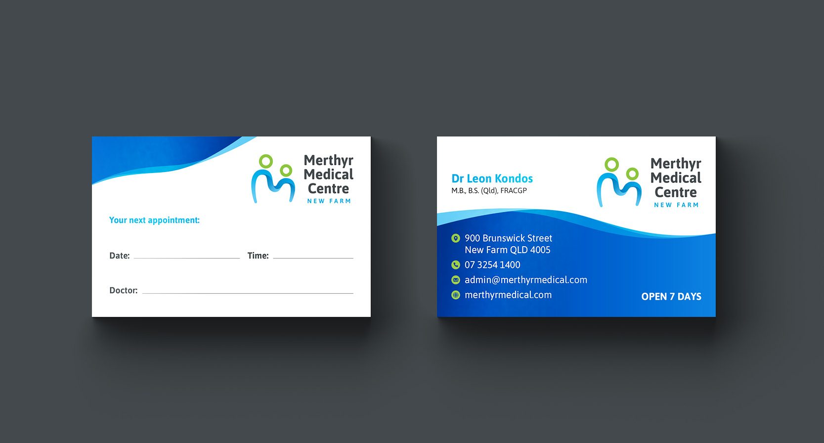
We applied the new logo across a range of assets, giving Merthyr a cohesive, professional brand that was long overdue! The logo was designed to work effectively across everything from uniforms to social media, to appointment cards, to the clinic signage.
The modernised brand appeals to the relatively youthful demographic of New Farm, and sets the clinic up to attract new clients in the future.

