Q Shelter
BRAND MANAGEMENT | GRAPHIC DESIGN
BRIEF:
Q Shelter works to support the community housing and homelessness sector. The organisation approached Focused Marketing to revive a brand which was dated and not representative of the overall business direction. Focused Marketing’s aim was to modernise the brand and communicate to the public Q Shelter’s
new purpose and offering.
Solution:
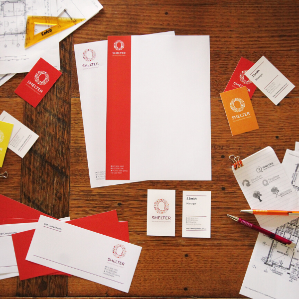
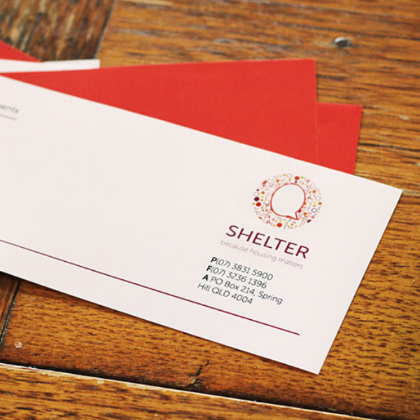
To create an updated identity Focused Marketing worked closely with the Q Shelter team to better understand the organisation’s values and purpose. Key words were identified to describe the business, leading to the creation of a stylised representation of community through the aesthetic of a microchip – which portrays Q Shelter’s knowledge and ability to see the bigger picture in community planning.
The ‘Q’ in Q Shelter is shaped like a speech bubble, which further strengthens the theme of knowledge and advice. Bright colour palettes and a clean sans serif font were created to give the logo vibrant strength.
Outcome:
Q Shelter’s corporate image has been modernised to represent the brand’s values and the organisation’s offer to the community, in a friendly, professional, and appreciable aesthetic. The new identity addressed all of Q Shelter’s rebranding objectives; an up-to-date and relevant look which supports its future business direction.