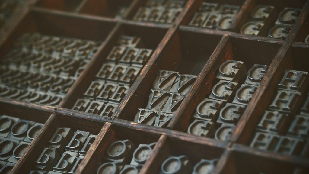
Typography (noun.) the art or procedure of arranging type or processing data and printing from it.
As graphic designers are taught at college, “good typography is invisible, bad typography is everywhere”. Good typography should go unnoticed and work silently for your brand. Typography is the foundation of your brand identity. Just as colour, photography and tone of voice all influence how your brand will be perceived and remembered, so too does the style of your typography. Therefore it’s vital that it is well-considered and meaningful.
Nail your typography from the start
When you’re building (or refreshing) your brand, your logo will underpin your entire visual identity. Therefore the typeface used in your logo itself should be well thought-out and capture the essence of your business. This is where we can help!
Usually we will undertake a brand strategy workshop at the offset to define your unique brand personality and where your business sits on the personality spectrum. Your brand may be traditional or innovative, exclusive or accessible, loud or sensitive. All of these factors will influence the chosen typeface(s). Graphic designers have the tools and knowledge (as well as an extensive library of typefaces to choose from!) to select typography that will best embody your brand. Additionally, when we’re crafting the type in your logo we will customise it by tweaking the kerning and leading, and/or adjusting the forms of the letters, to create a distinguished arrangement of type that is unique to your brand.
In some cases the type can be strong enough to form the logo in its entirety. This style of text-only logo treatment is known as a wordmark or logotype. Wordmarks are used by some of the most iconic brands in the world – think Coca Cola, Google or Disney.
What’s the difference between a typeface and a font? Oftentimes these terms are used interchangeably, but technically they’re different things. A typeface is the overall “font family” and is comprised of multiple fonts at different weights and styles. So for example, Arial is a typeface, while Arial Bold Italic is a font.
Consistency is key
Your designer will spend time and consideration to craft a unique logo and brand identity, carefully selecting the typefaces that work best for you. These should be kept as consistent as possible and be applied in your marketing and communications across the board. Once your brand has been refined and established we will create a style guide. Typography will of course form a key part of these guidelines.
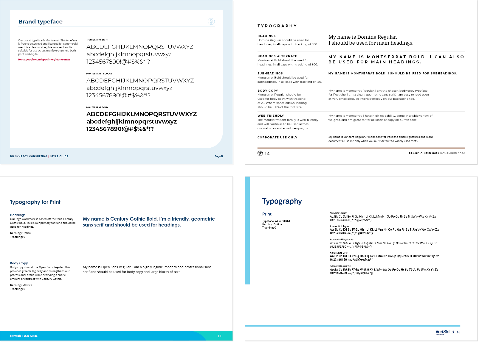
Examples of various style guides created by Focused Marketing and the pages describing typography
Generally we will select one to three typefaces that are suitable for usage across print and digital channels. These typefaces should then be applied across all of your marketing collateral. Typography is at its strongest and most subtle when it is kept consistent and simple. Remember that the best typography should go unnoticed – it will subconsciously be absorbed by the consumer and just make sense. Using a random mix of typefaces across different aspects of your brand is a big no-no, as it will water down your overall image. Sticking to the designated typefaces helps reinforce your brand image, which in turn establishes trust and recognition.
Not all typefaces are web-friendly. In this case we will advise of an alternative font that should be used on your website. As part of the style guide we will also advise of a default system typeface that would be used for your internal communications only, ie. a typeface that all users can easily access as it comes pre-installed on all devices – but wouldn’t be used across any of your external marketing.
Just as in fashion or music, trends in typography come and go over time – but these shouldn’t bear a strong influence over the choices made for your brand. The best typography is relevant, timeless, and won’t look outdated or tacky when the trend fades away. The longstanding popularity of iconic and beautifully designed typefaces like Helvetica, developed in the 1950s, are a testament to this.
We’re experts in brand development and can help you harness the power of great typography – so if your brand is in need of a boost, get in touch.
Recent Comments