Work180
LOGO DESIGN | STYLE GUIDE | BILLBOARD DESIGN | STRATEGY WORKSHOP | MESSAGING
BRIEF:
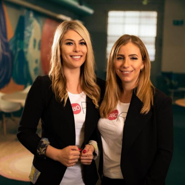
Gemma Lloyd and Valeria Ignatieva founded WORK180 after experiencing a working world that was failing women. Work180 is an innovatively transparent job board helping women around the world to confidently apply to workplaces with a proven commitment to diversity, inclusion, and gender equality.
Focused Marketing was first engaged to provide the creative for a billboard campaign that ran throughout Melbourne. In the process, we talked a lot about brand identity, message segmentation and how the business was perfectly placed to make a difference in an emerging #metoo world. That set us on a path to facilitating a workshop where we developed a strategy for extending brand reach.
Outcome:
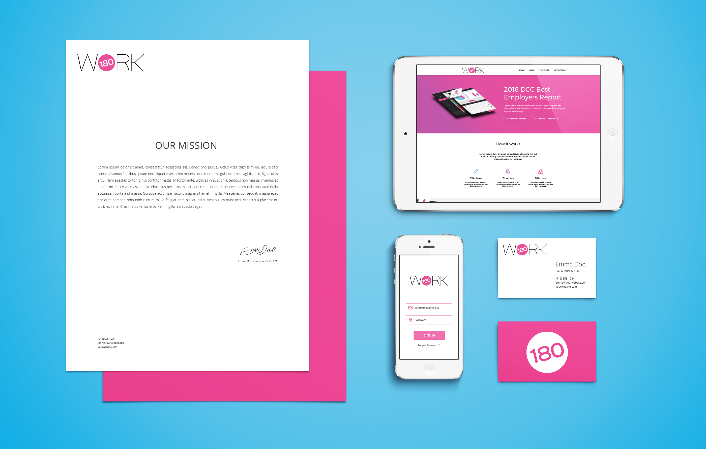
Along the way, we designed a logo for the new name, choosing a strong but simple font that uses symmetry to communicate the company’s commitment to fairness and equality. We also transformed the letter ‘O’ into a pink dot, which is now used as an official seal of approval for endorsed employers.
Once Work180’s internal designers started applying the logo to brand assets, we captured everything in a comprehensive style guide to ensure consistency across all platforms.
Fast forward to now and the founders have become respected media commentators on women’s issues, the business has received backing from a group of serious investors and more recently, Work180 has launched in America and the UK.

